
Design systems were supposed to make product design faster. For many teams, they've become another system to manage—full of variants nobody uses, documentation nobody reads, and components that almost match what designers need.
In 2026, the designers who ship fastest aren't the ones with the biggest libraries. They're the ones using systems that stay out of the way: clear defaults, matching Figma and React components, and enough structure to stay consistent without requiring a dedicated design ops team.
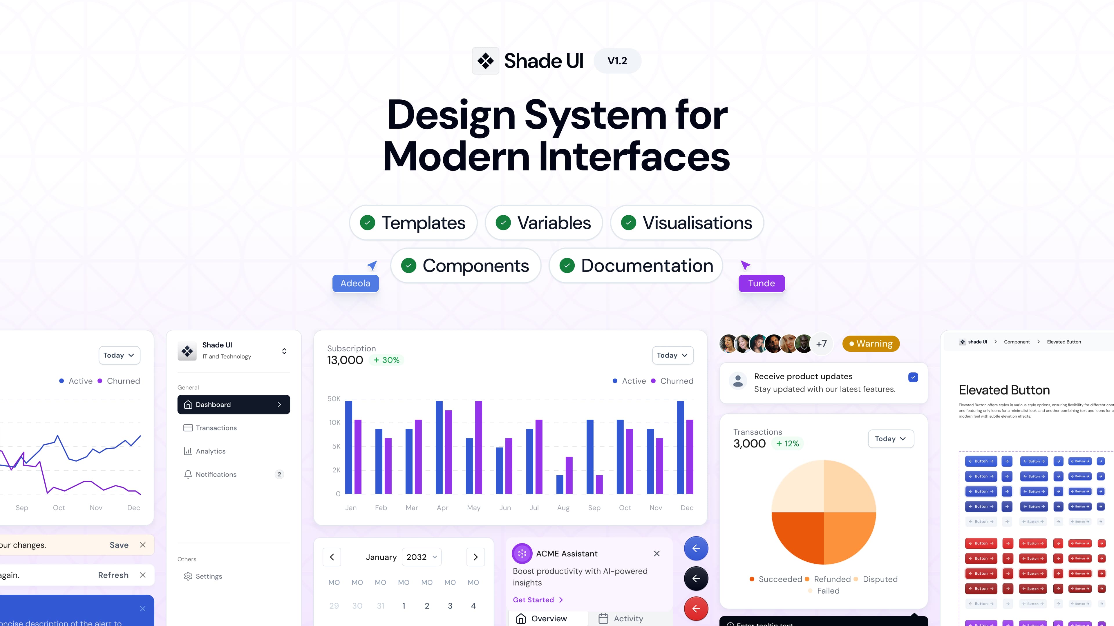
That's the gap ShadeUI was built to fill—a component library and design system where Figma and React share one component contract, so design and code stay aligned.
Why Design Systems Matter More Than Ever
Every product team faces the same underlying problem: interfaces drift. A button gets rebuilt with slightly different padding. A modal uses a different shadow than the rest of the app. A new feature ships with typography that doesn't match the marketing site.
Individually, these inconsistencies seem minor. Collectively, they make products feel unfinished—and users notice, even if they can't articulate why.
Design systems exist to solve that drift by giving teams shared building blocks: typography scales, spacing rules, color tokens, and reusable components for buttons, forms, navigation, and data display. When the system works, designers and developers stop reinventing the same patterns and start focusing on product problems.
The challenge in 2026 isn't whether you need a design system. It's finding one that actually reduces work instead of creating it.
The Problem With Heavy Design Systems
Enterprise design systems often fail solo creators and small teams for predictable reasons:
- Too many variants. Six button sizes and twelve styles force a decision every time someone adds a component to a screen.
- Figma and code live separately. Designers work in one tool, developers in another, and the two drift apart within weeks.
- Documentation compensates for complexity. If you need a wiki to use a button, the component design needs rethinking.
- Setup overhead. Weeks of token configuration before shipping a single screen.
Large companies can absorb that overhead. Startups and indie teams can't—and shouldn't have to.
What Makes ShadeUI Different
ShadeUI takes a deliberately minimal approach: enough structure to stay consistent, not so much that it slows you down.
Figma-First, Not Figma-Only
ShadeUI starts in Figma with design tokens for typography, spacing, grids, and a refined grayscale palette with accent colors. But unlike Figma kits that stop at mockups, every component has a matching React implementation styled with Tailwind CSS.
That parity matters. When a designer places a `Button/Primary` in Figma, the developer uses the same component name in React. No translation layer. No guessing whether "large" in Figma means `size="lg"` or `size="xl"` in code.
How You Use It
ShadeUI is a component library—not an npm dependency you’re locked into. You choose how to bring components into your project:
Browse Storybook and copy. Most teams start here—find a component in Storybook, copy the React + Tailwind code, and drop it into your app. You own the code from that point.
Install via npm (optional). If you prefer importing components directly, the library is also published as @shadeui/ui:
npm install @shadeui/ui
import '@shadeui/ui/styles.css';
import { BezelButton } from '@shadeui/ui';
Scaffold full screens with the CLI. For composed flows like dashboards or login pages:
npx @shadeui/ui add chat-01Templates in v1.2 include chat, dashboard, billing, login, signup, team, invoice, and settings—all built from the same component families (Button, Badge, Banner, Input, TextArea, Avatar, and more).
Copy from Storybook, install from npm, or scaffold a template. Same components, same tokens, same APIs.
Agent-Ready by Default
ShadeUI ships with `AGENTS.md` and `llms.txt`—machine-readable docs so Cursor, Claude, and other AI coding tools use your actual components instead of inventing generic Tailwind markup. Combined with Storybook and Figma Code Connect mappings (`*.figma.tsx` files next to each component), AI-generated UI stays aligned with your design system.
Design Tokens That Scale
Shared tokens for color, spacing, and typography mean theming stays consistent whether you're building a marketing landing page, a dashboard, or an internal tool. Change a token once; it propagates across Figma and React.
Who ShadeUI Is Built For
ShadeUI works best for teams that need to move fast without sacrificing polish:
- Early-stage startups building MVPs where the first impression matters as much as the feature set.
- Designers working closely with engineers who need Figma mockups to map cleanly to production code.
- Solo founders and indie hackers who can't afford a design team but refuse to ship ugly software.
- Product teams tired of rebuilding the same UI patterns for every new feature.
It's less ideal for teams that need deeply customized enterprise patterns out of the box—complex data grids, industry-specific compliance UI, or heavily branded systems that diverge completely from standard patterns. Those teams may need bespoke design ops. Most SaaS products don't.
How Designers Actually Use ShadeUI
A typical workflow looks like this:
- Design in Figma using ShadeUI components and tokens to mock up screens.
- Hand off with confidence because component names, variants, and spacing match the React library.
- Implement in Next.js or React by copying components from Storybook, installing via npm, or scaffolding with `npx @shadeui/ui add`.
- Customize where it matters—brand colors, copy, layout—without rebuilding primitives.
Compare that to the traditional workflow: design in Figma, export specs, developer interprets padding values, builds custom components, designer reviews and finds three inconsistencies, repeat for two weeks.
ShadeUI vs. Building Your Own System
Building a custom design system from scratch makes sense at scale—hundreds of engineers, multiple product lines, years of investment. For everyone else, it's a distraction.
Rolling your own means defining tokens, building components, writing documentation, maintaining Figma files, and keeping everything in sync as the product evolves. That's months of work before you ship a feature.
ShadeUI gives you a production-ready foundation on day one. You're not starting from zero; you're starting from patterns that already work together. The time you save goes into differentiation—your product's unique flows, not another button variant.
Getting Started
If you've been searching for a lightweight design system for Tailwind, a React component library with matching Figma files, or a way to unify design and code without enterprise overhead, ShadeUI is worth exploring.
Browse Storybook, copy a component into your project, or install via @shadeui/ui if that fits your workflow. Most teams know within an afternoon whether it clicks.
Design systems should empower creativity, not slow it down. ShadeUI gives you the foundation to build fast, accessible, visually consistent interfaces—without the overhead that makes most systems feel like a second job.